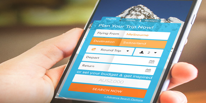
Responsive design is the technique to make websites respond to the environment they are being presented in, so that they display and function cleanly across a range of devices.
Why is responsive design important?
The number of web-enabled devices continues to grow. The audience share of websites viewed from portable devices (laptops, tablets and mobiles) is ever increasing. So it's important that your site presents and functions correctly on all of these devices.
Responsive design solutions detect the type of device requesting your website ("device sniffing"), then based on this detection, deliver an appropriate device-specific version of your website to display. A fluid design type is also used to ensure that your website will adapt to a range of screen sizes.
Social Change Media implements responsive design solutions on all our sites so that they look great regardless of the device or size of screen they are being presented on.